Seeing photographs from the museum's May 31, 1970 dedication prompted this question:
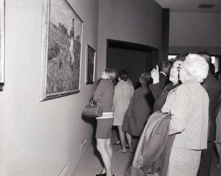
Why was "The Prairie is My Garden" hung so much higher than we hang it today?
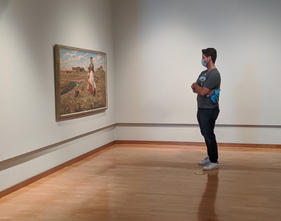
South Dakota Art Museum Exhibitions Curator, Jodi Lundgren, said that while there's no "golden rule" for precise hanging height, current practice is to hang most works at eye level, typically centered 55-60" from the floor. Ninety-nice percent of the time we hang at 56" at the museum. Lundgren went on to say:
"Others say with taller ceilings up to 70” counts as “eye-level” but you’d have to be at least 6’ 6” tall for that to be true. Way too high in my opinion unless the work itself is 8’ tall or taller. The curator I worked for early in my career said that people used to be shorter and smaller and eye level was considered to be lower and then shifted up in the modern era because people were getting taller and bigger. I don’t have a scholarly source for that info—just something he told me (which makes sense but I don’t have a source to prove it as a historical fact). So basically, it was lower, then shifted up."
ADA Influences
"Then the Americans with Disabilities Act of 1990 happened and people became more conscious about comfortable viewing for folks using wheelchairs and children, and the standard dropped back down to a new “average.” A lot of commercial art galleries use 60” high and I think that’s too high. It’s completely comfortable to me and I’m on the taller side so I just don’t believe that’s accommodating the average, which is supposed to be what we’re aiming for. Some will look up a little, some will look down a little but hopefully, at average height, no one is straining too much, which is key.
You can tell from the Dunn gallery picture that it’s too high for comfort. Most of the people in that shot are looking up, so it clearly wasn't based on average eye level. Someone in a wheelchair would really have to strain to look up. We want to avoid that. 99% of the time we hang at 56” center. I’ll go down to 54” for a show that is geared towards children like our children’s book illustration art show or higher if they’re really large works—frankly our gallery walls with that niche 18” up from the floor force me to hang large works considerably above eye level center at times.
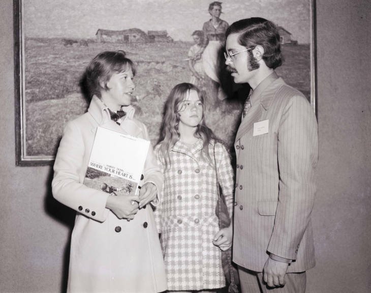
It would be good to know how tall Bill Landwehr was.(William Landwehr was the museum's first director and is pictured with Harvey Dunn's granddaughter, Diana Burkhardt [Rutherford] and great-granddaughter, Laura Burkhardt {O'Connell].) "The Prairie is My Garden" looks like it’s about eye level for him, but super high for Diana and Louise Rutherford. Perhaps he was tall and was hanging above 60” center—hanging the works for the best viewing for himself."
Salon Style
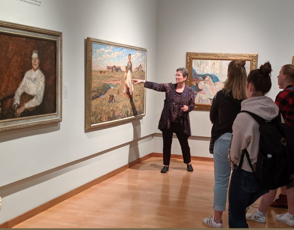
Lundgren's predecessor, John Rychtarik, commented that salon-style hanging—in which paintings are hung floor to ceiling, one above the other—was popular in the 1960s. This enabled museums to display many more works from their collections at one time (and is required for exhibitions like the museum's "All Dunn: The Complete Harvey Dunn Collection" because of the sheer number of works on display). "Then professional curators came on the scene who created thematic exhibitions of curated pieces," Rychtarik noted, "and storytelling became a bigger focus."
As we start pulling more photos from our archives during this 50th anniversary year, it will be interesting to see if we can identify shifts in hanging heights and exhibit styles. Stay tuned for more!


